Read the Heatmap as a Stop Map, Not a Roadmap.
By CryptoTraders · Market Education · 2026-05-30
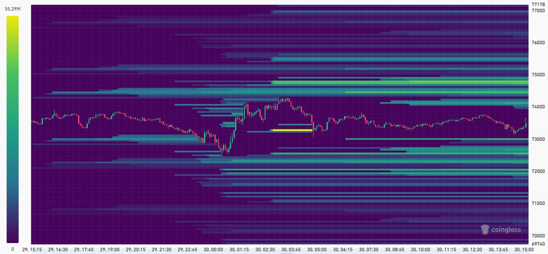
Every other day there is a screenshot on crypto Twitter of a Coinglass liquidation heatmap with an arrow drawn to the brightest cluster, captioned 'magnet.' That framing is half right and entirely dangerous. The brightest cluster is where leveraged stops are most densely projected to sit. It is not a destination. It is a probability cone for where a stop run could go, and even that depends on what else is happening.
What the heatmap actually shows
The Coinglass liquidation heatmap is model output, not raw data. It aggregates open interest and trading volume across Binance, Bybit, OKX, and other major venues, assumes a distribution of leverage across that OI, and projects where the resulting liquidation cascade would trigger if price reached each level. Brighter and warmer bands mean a higher projected magnitude of liquidations at that price. Cooler and dimmer bands mean less leveraged interest sitting there.
This matters because the chart is showing you a probabilistic estimate, not a record of where liquidations have actually happened. The methodology has been stable since launch and was confirmed unchanged in 2026. The intensity is also relative, not an absolute dollar amount. A bright band on a quiet day is not the same as a bright band during a $5B OI run-up.
How to read the bands
Horizontal axis is time. Vertical axis is price. The brightest horizontal bands are the levels with the densest projected liquidation magnitude. Coinglass labels these 'magnetic zones,' and the framing is useful as long as you remember it is reverse-causal. Price gravitates toward those zones because that is where leveraged positions are concentrated and where stop-running creates fuel. Price does not have to reach them.
Timeframes available are 12h, 24h, 7d, 30d, 90d, 180d, and 1y. The right one depends on what trade you are running. A 30-day heatmap is irrelevant if you are holding a 1-hour scalp. A 24-hour heatmap is too noisy if you are sizing a multi-week swing.
The common misreads
Four traps catch most readers:
1. Treating the heatmap as deterministic. The brightest cluster is where price is likely to gravitate if a leg starts, not where it must go. Strong directional trends drive through everything with no bounce.
2. Mixing timeframes. The 30-day heatmap on a 4H trade is reading the wrong question. Pick the timeframe that matches your hold time.
3. Ignoring that the heatmap is dynamic. The cluster you saw yesterday may have already been swept and rebuilt elsewhere. Refresh it.
4. Treating low-intensity zones as safe. Price can move quickly through low-density areas precisely because there is nothing there to slow it down. A sparse zone is not a support level.
A sensible workflow
Use the heatmap as one input, not the input. The workflow that actually works:
Pull the timeframe that matches your hold. Identify the densest clusters above and below current price. Cross-check those levels against market structure: recent swing highs and lows, value-area edges, key moving averages. If a cluster aligns with structure, treat it as a high-probability target for a sweep, not a reversal pivot. Confirm with open interest direction (rising into the level means leveraged positioning is building toward the sweep, flat means it is already coiled) and with funding (if funding is extreme in the same direction as the trade you are considering, the move into that cluster is the path of least resistance).
A cluster aligned with HTF resistance, into rising OI, with stretched funding, is a very different signal than the same cluster on its own.
Where our scanners fit
The Liquidity Sweep Scanner watches in real time for sweeps of daily, weekly, and Monday highs and lows. Those are the institutional reference levels the heatmap clusters most often align with, and when one gets taken, the scanner posts it immediately so you can see whether the sweep is happening into the kind of cluster the heatmap was flagging.
The OI Scanner runs in parallel and surfaces when open interest on a pair surges statistically above its own baseline. Combine the two and you get the missing context a static heatmap cannot give you: not just where the stops are, but whether positioning is actively building toward them.